MUTTRAH’S FISH MARKET BY SNOHETTA
Muttrah's fish market has always been more than just a place for trading. It's a cultural emblem that anchors the northern end of the old town's corniche in Muscat. A neighborhood staple of the local community's everyday life, the vendors roll out what seems to be the entire ocean each morning. The first time I visited the Muttrah fish market was in 2010, and while observing the sellers' movements and faces, I realized the historical importance of the place. As vendors laid out the morning catch on counters hoping to attract potential customers, they told stories to one another – it was a scene I felt would one day become a part of history as there were no young people within sight. Was this to be the last generation keeping the Muttrah fish market alive? Would the market soon disappear, remembered via a nice memorial plate placed at the end of the path along the corniche? Luckily not.
In 2009, local authorities started the construction of a new market designed by Snohetta. I've read many articles released by the architecture firm, and the one statement that always stood out to me was that the new fish market is "designed to unite the old and the new sympathetically." I visited the market once again with the hope of understanding if and how the new market achieved this. From the analysis of the plani-volumetric system, the building declares a sensitive consideration of both the morphological and local cultural context. The curved plan is designed as a natural extension of Muttrah's corniche – a gesture that immediately communicates the designer's intention in pursuing a careful integration of the surroundings. A series of spaces follow one another continuing the promenade's pedestrian path inside the building, while a large roof unifies the volumetric sequence.
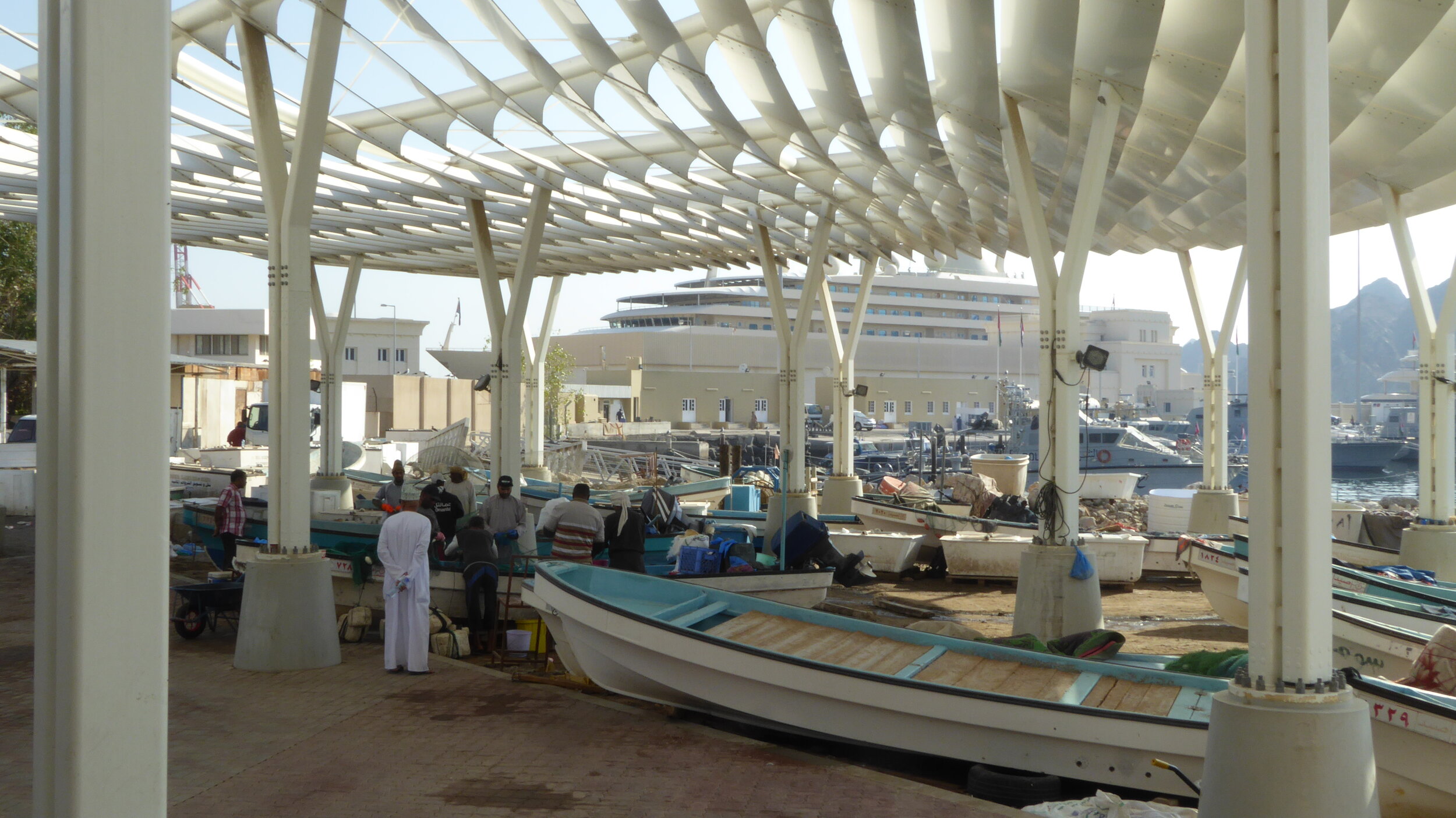
The typology of a grand roof covering independent volumes, however, is not original. This design solution is used when functional complexity needs to define specific volumes and perceptually unify different components as a single architectural object. The earliest examples of this can be traced back to the Japanese Metabolist avant-gardes of the 1960s. Jean Nouvel is undoubtedly the contemporary architect who is currently most fond of this type. His expansion of the Museo Reina Sofia in Madrid and his work on the Culture and Convention Center in Lucerne and the recently completed Louvre Abu Dhabi exhibit the French architect's tendency toward spatially unifying all the tectonically separated components of an architectural organism by a large roof. The slatted canopy features a waved form that fosters a formal dialogue with the rocky formations located behind the market. At the same time, the plan of the same is conceived through an organic design casting a continuous dance of light and shadow on the open spaces and volumes beneath. The canopy was meant to refer to Arabic calligraphy, but its materiality and the absence of a clearly definable geometry evoke a vast and intricate fish-bone.
The aluminum fins that jut outward from the canopy mark gravitational areas that are positioned to underline the planimetric presence of notable points, such as the external passages from one volume to another, as well as the main entrances. Therefore, there is a clear hierarchy between different parts of the canopy that require an adequate compositional response through its vertical supports design. Instead, the columns seem to be indifferent to the variable conditions of the roof. The same vertical and terminal solutions are used repeatedly regardless of the specific settings dictated by geometric variations. Structural requirements dictate columns' position, but their connection to the louvers appears casual and at times odd. Greater flexibility in the definition of this detail would have been preferable.
The section of the building addresses its functional requirements. The ground floor houses the fish, fruit, and vegetable market, as well as external connections and the terminal area dedicated to the unloading of fish and the storage of small boats. The two commercial spaces arranged along the building's curve are Spartan, in that they are utilitarian, practical, and masculine, but they are welcoming.
Some walls, especially on the northern side, are internally decorated with mosaics that add a gentle touch. In contrast, on the southern side of the project, a parametric matrix of small openings manages the daylight. It allows for transversal ventilation (always welcome in spaces with extreme olfactory conditions). At night, the same pattern on the southern side wall forms an attractive illumination that can be perceived from the corniche.
The upper volumes, mainly glazed and independently accessible through a dedicated vertical circulation, will host public spaces and a restaurant. The area is specially designed for tourists who, from that level, will be able better to admire the scenic gulf and the historical centre. The new fish market designed by Snohetta is a sensitive building that promotes a critical concept perhaps often forgotten: architecture can, if correctly conceived, produce contemporary buildings that are still able to respect local cultures, augmenting the potential and the understanding of historical contexts.


